Visualizing the Air we Share
By Dan McCarey
Most of the time, the things that are most dangerous to us are the hardest to see. Air pollution is one of those things — invisible, diffuse, always moving. It shapes our health and our climate, but unless you’re standing next to a smokestack, you don’t really see where it comes from or how it spreads.
What’s a plume?
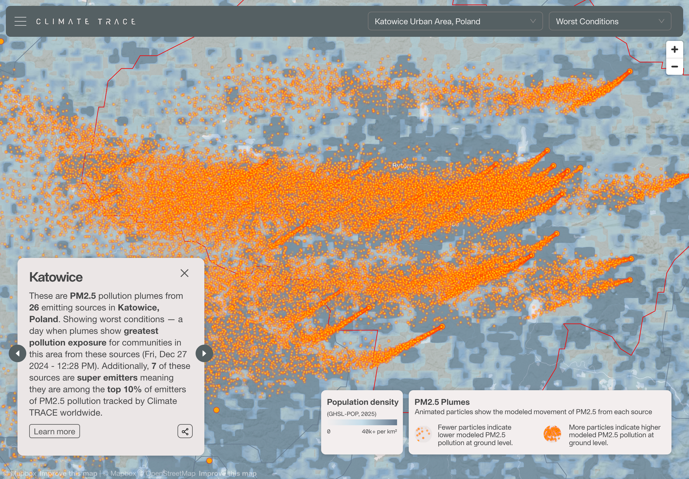
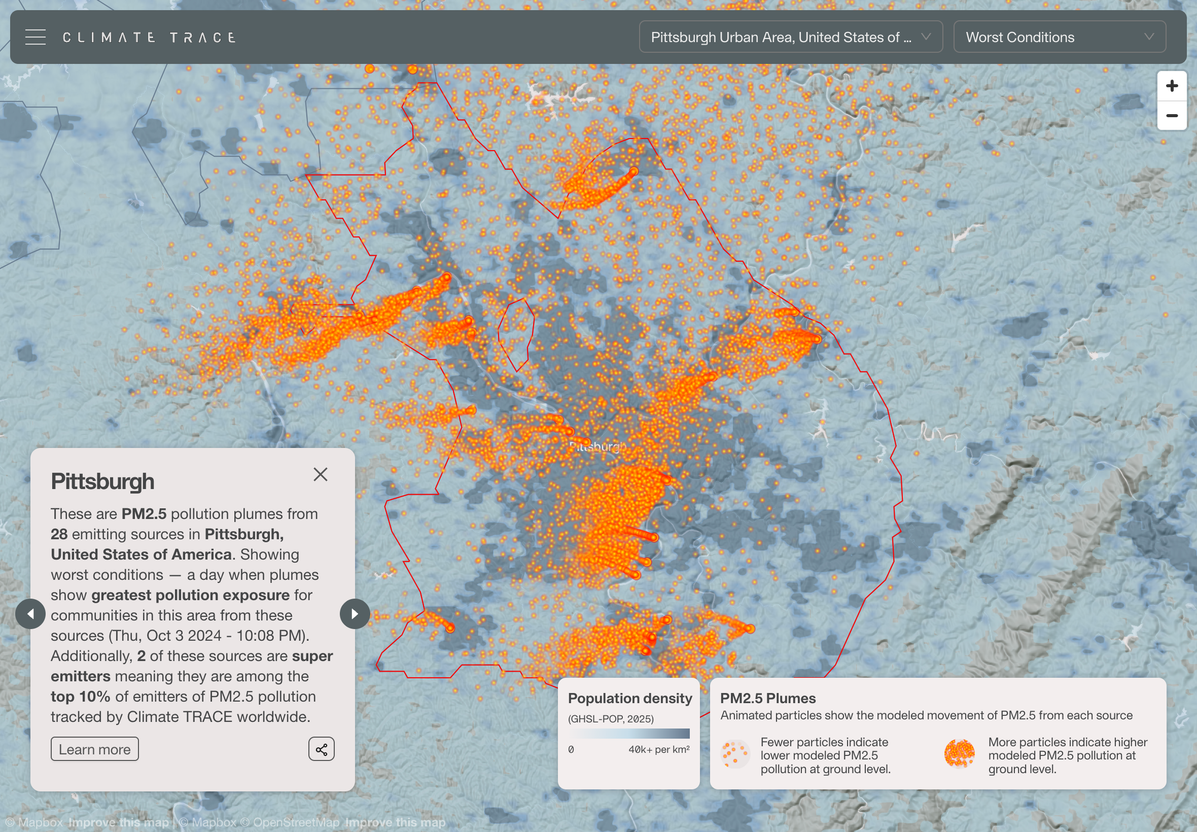
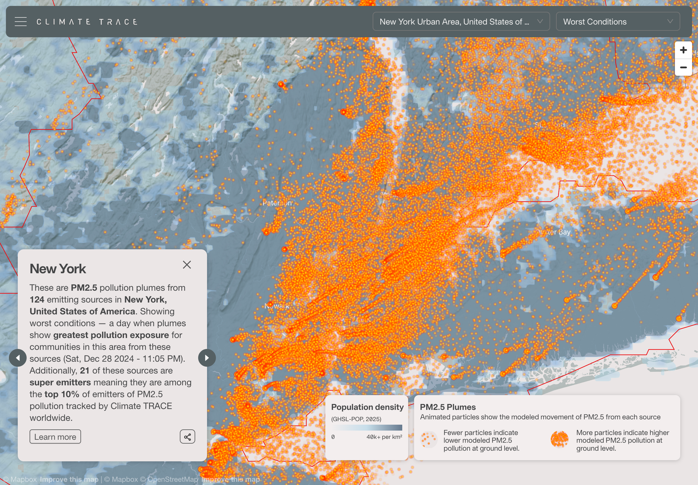
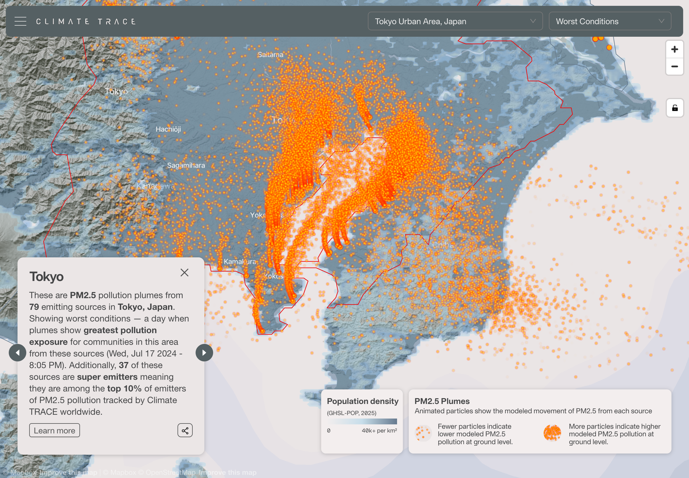
In simple terms, a plume is a cloud of pollutants released into the air. When a power plant, refinery, or factory emits fine particulate matter (PM2.5), that pollution doesn’t just hang around the smokestack. It disperses into the atmosphere, shaped by wind, weather, and terrain, drifting into nearby towns and cities.
Plumes are how emissions become exposure. They’re the bridge between a single source and the people downwind.
The challenge of showing the invisible
One of the big challenges of working on Climate TRACE’s data is that it’s inherently abstract. We know the numbers: tons of CO2, kilograms of particulates, gigawatts of energy. But numbers alone don’t communicate the human impact.
Plumes are tricky to show because they’re not static. They expand, fade, and shift direction with the wind. Representing that motion in a way that’s both scientifically grounded and visually legible is the hard part. Too subtle, and it looks like nothing’s happening. Too heavy-handed, and it stops feeling like data.
Building the plume map
Climate TRACE — cofounded by Al Gore — is the project owner behind this work. The coalition brings together more than a dozen organizations, including the one I work with, Earth Genome. My role has been building the interactive visualization that makes the data explorable.
To generate the plumes themselves, we partnered with researchers at Carnegie Mellon University (CMU). They used the HYSPLIT atmospheric dispersion model to simulate how pollutants spread from individual facilities, producing the raw data for where emissions go, how they evolve in the atmosphere, and which populations they reach.
This wasn’t new territory for CMU. They’ve been experimenting with ways to animate PM2.5 plumes for years, alongside a range of other experimental visualizations. At COP28 in 2023, Al Gore worked with CMU to produce animated plume demonstrations, which showed how far emissions can travel from individual sources. That experience drove the ambition to scale up this effort globally under the Climate TRACE banner.
The logic is simple but powerful: PM2.5 is not only a health hazard — it’s also a proxy for carbon pollution. If you eliminate the PM2.5 from burning fossil fuels, you also eliminate the CO₂ driving climate change. Al Gore emphasized this connection, and it has shaped Climate TRACE’s strategy to make plumes visible everywhere.
For the Climate TRACE collaboration, CMU also worked with us directly on the visualization layer. Together, we iterated on a custom WebGL shader to animate the plumes so they would feel alive — drifting, pulsing, dissipating into the atmosphere in a way that matched the underlying science while remaining clear to the eye.
On my side at Earth Genome, I built the interactive framework using Next.js, React-Map-GL, and Deck.gl, integrating CMU’s plume data and shader work into a map interface. The data itself is served from Amazon S3 via CloudFront, each plume pre-calculated into a JSON file.
On the front end, the map cycles through key cities and major emitting facilities. When you zoom in, you can see individual plumes tied to assets: a cement plant in Chongqing, a refinery in Houston, a steel mill in India.
Why it matters
These visualizations aren’t just pretty animations. They’re a way of making the consequences of emissions impossible to ignore. A single facility’s plume can stretch across an entire metro area, exposing millions of people to unhealthy air.
And by showing PM2.5 — both the immediate health risk and the climate proxy — the visualization connects two struggles often treated separately. Clean up the air we breathe today, and you’re also tackling the carbon pollution that threatens tomorrow.
Reflections on design
What I’ve learned working on plumes is that visualization is always a balance. On one side, there’s the scientific rigor: making sure what you show corresponds to real data. On the other side, there’s clarity: simplifying enough so that a viewer can instantly grasp what they’re seeing.
Working with CMU on the shader design was a great example of that balance — translating atmospheric science into visual motion that’s both accurate and legible. The right shade of gray or red, the right rate of fade — those are design decisions that carry weight. Get them right, and you can make the invisible visible.
Closing
For me, the plumes project is a reminder of why I do this kind of work. Maps and data visualizations aren’t just technical artifacts — they’re ways of shifting perspective. They help people see things that are otherwise hidden, and sometimes that’s the first step toward change.