By Dan McCarey
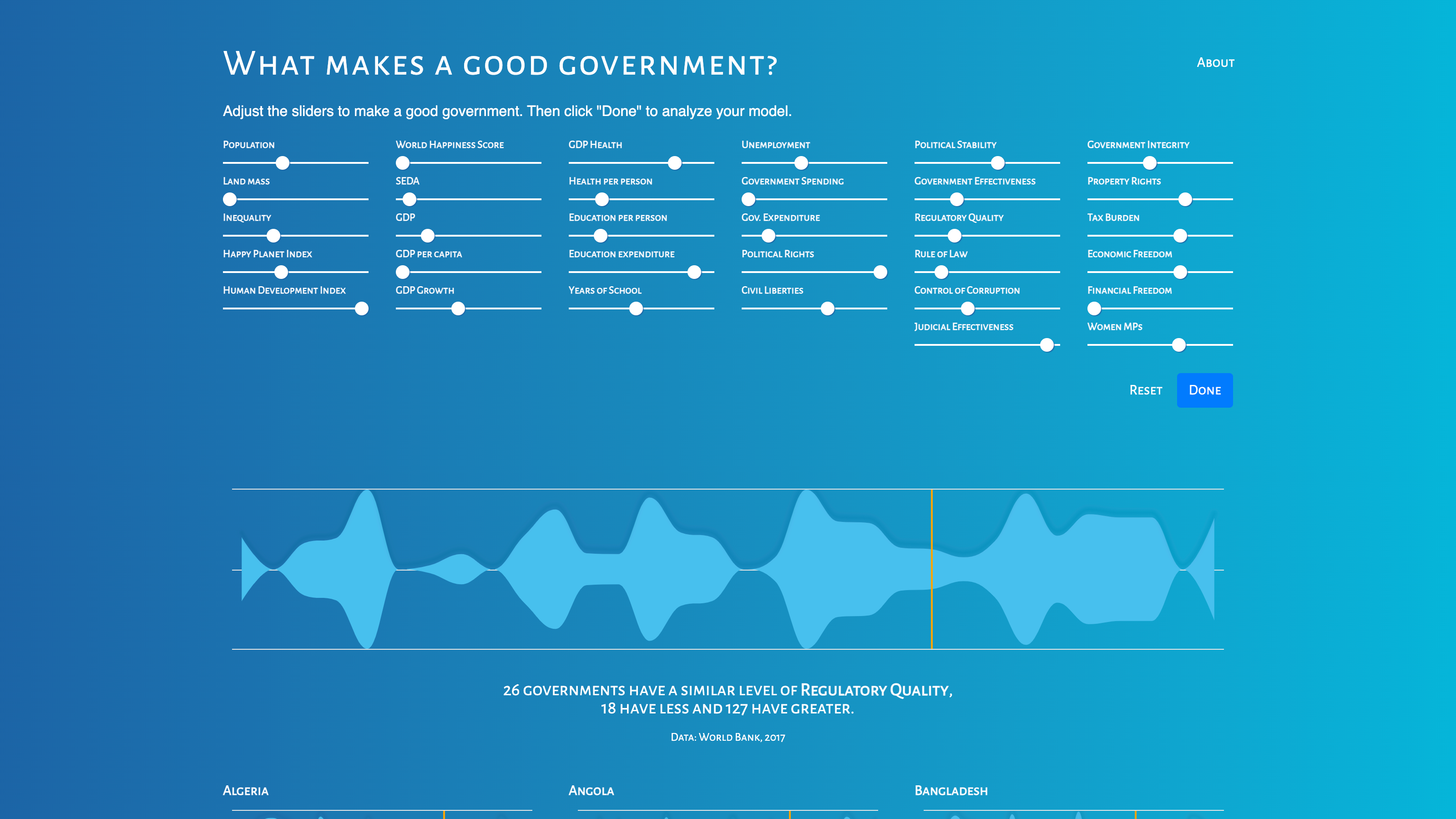
In a world where governance styles vary dramatically across nations, understanding the attributes that make a government effective is more crucial than ever. This was the driving force behind my entry for the World Data Visualization Prize, which aimed to dissect and visualize the components of good governance. The interactive tool I created allows users to explore and compare governments across 32 different indicators, offering a unique, real-time perspective on global leadership.
The Concept: Personalizing Governance Analysis
The project's core idea was to enable users to define what 'good governance' means to them. This was achieved through an innovative application that incorporated adjustable sliders representing various governance indicators such as economic stability, civil liberties, environmental policies, and social welfare. By adjusting these sliders, users could create their personalized blend of governance attributes, reflecting their views on what factors are most important in effective leadership.
Real-Time Comparative Analysis
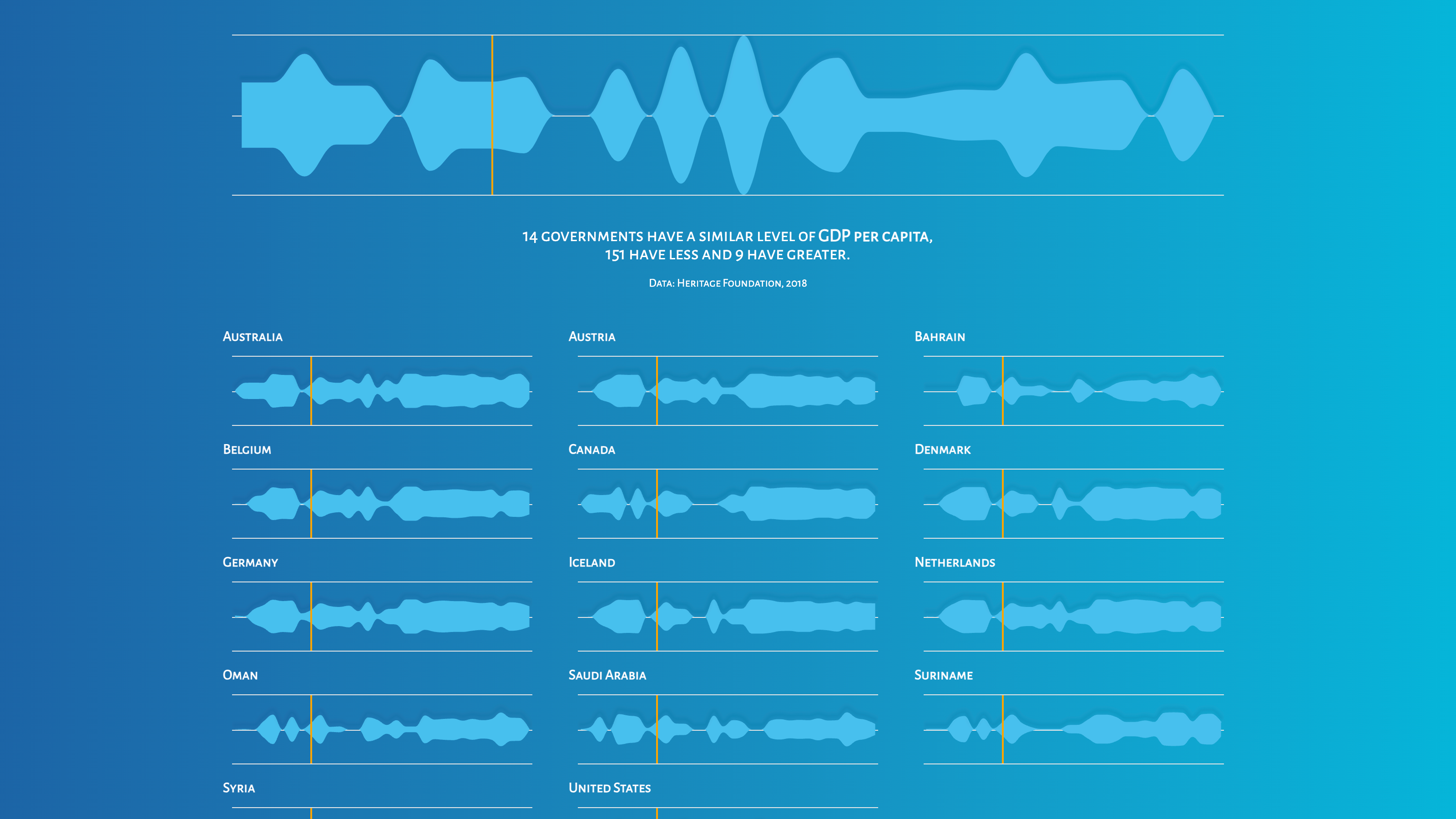
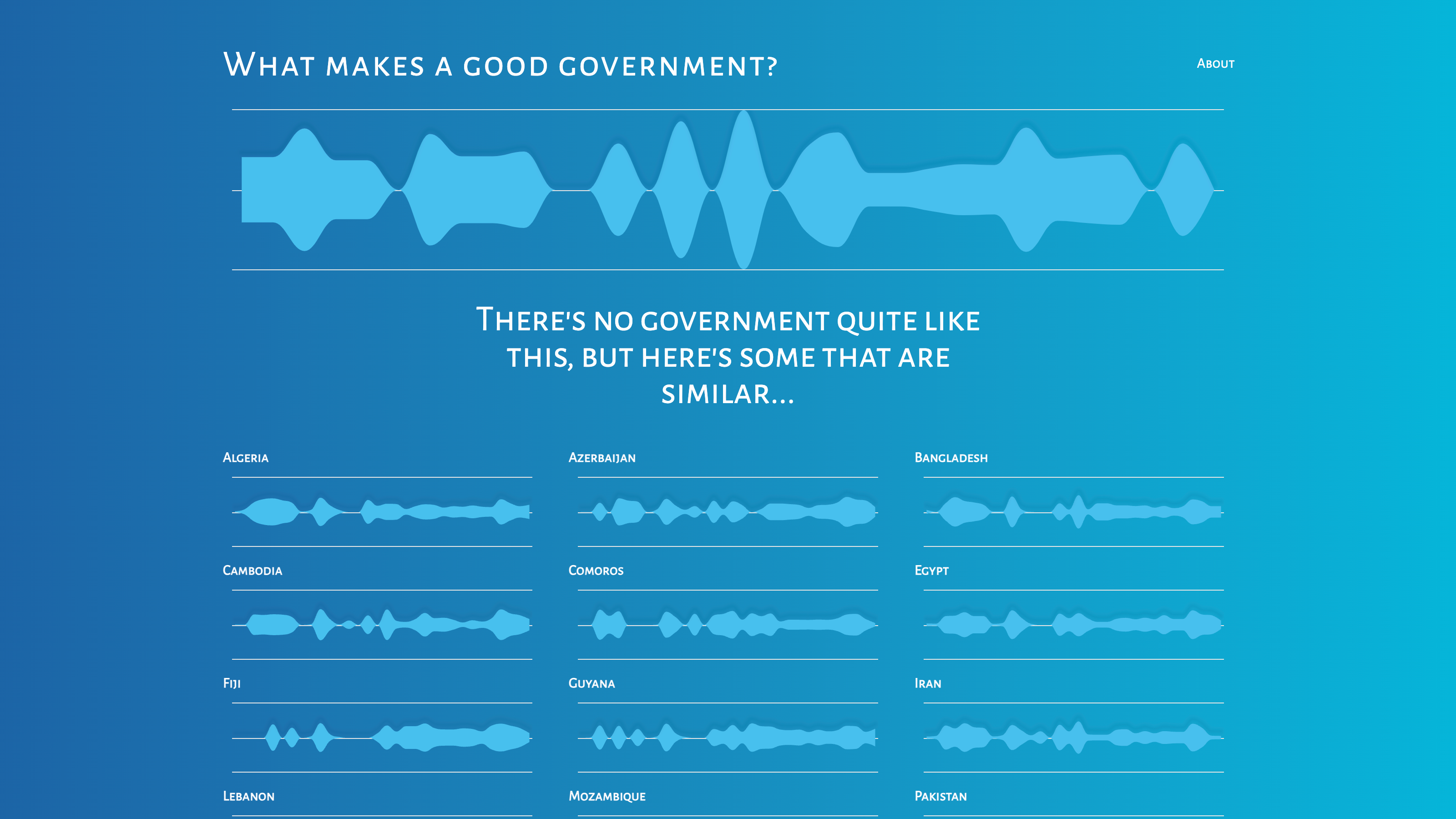
As users adjust the sliders to reflect their governance preferences, the app dynamically shows governments worldwide that most closely match these attributes. This feature not only provides immediate feedback but also encourages users to explore and understand the complex interplay of various governance factors.
Impact and Future Potential
The project has received positive feedback for its engaging approach to a complex subject. It serves as a powerful tool for education and analysis, helping users to understand the nuances of governance and its impact on nations. Looking forward, the potential to expand this tool to include more indicators or to apply similar concepts to other complex subjects is exciting.